

Photo by Cytonn Photography on Unsplash
Data Analysis and Visualisation - Mapping the Kenyan Startup Ecosystem of 2022 using Python
Using Pandas and Plotly


Introduction
Hello, I Am David Marko. I came across a report on the start-up ecosystem in Kenya graciously provided by DisruptAfrica https://disrupt-africa.com. By the end of the article, I hope to get a few insights into the Kenyan Startup Ecosystem in 2022.
Why?

I don't have a good answer to that. I got curious to see if there would be any patterns or relevant insights that could be of help sometime in the future. I also could have analyzed in MS Excel, but as a Python developer, my response to anyone who asks would be the famous quote
To a man with a hammer, everything looks like a nail
Requirements
Basic Knowledge of Python
Basic Knowledge of Using Jupyter or Google Colab
Python Libraries (Matplotlib, pandas, NumPy, Jupyter Lab)
Note: You can also download the excel file for the report from here. https://disruptafrica.gumroad.com/l/bqyjt
Installing Libraries
The first step was to open my terminal and install the following libraries by typing the following commands
We will be using Python3.0 and above
pip3 install jupyter
pip3 install numpy matplotlib pandas plotly
Jupyter Labs will help set up an environment for me to run python commands for cleaning and to visualize the provided data. Optionally, you can use Google Colab (https://colab.research.google.com/)
Set up Environment
I created a jupyter notebook instance by using the following command
jupyter notebookThis opens your default browser.
Create a new notebook in the folder you selected as indicated below. This will open a new tab for your notebook where we can start running python code.

Note:
Copy and paste the Excel file onto the same folder that you put your notebook in.
Initiating libraries and importing Excel files
First, let's import the libraries onto the notebook
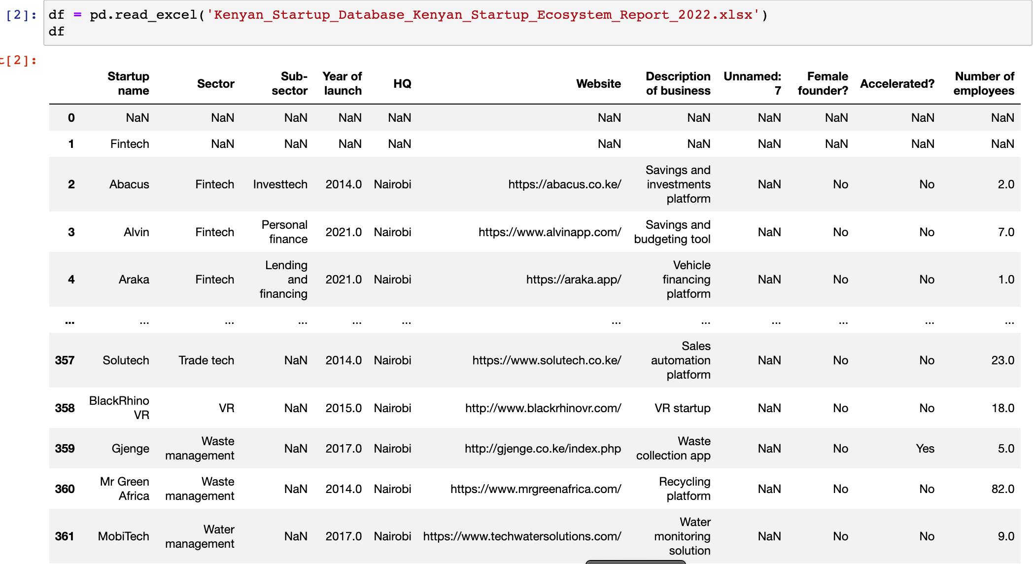
I loaded up the excel file we downloaded into pandas as a Dataframe. To ensure that the file was loaded properly, run df to view the structure of the dataframe.
df = pd.read_excel('Kenyan_Startup_Database_Kenyan_Startup_Ecosystem_Report_2022.xlsx')
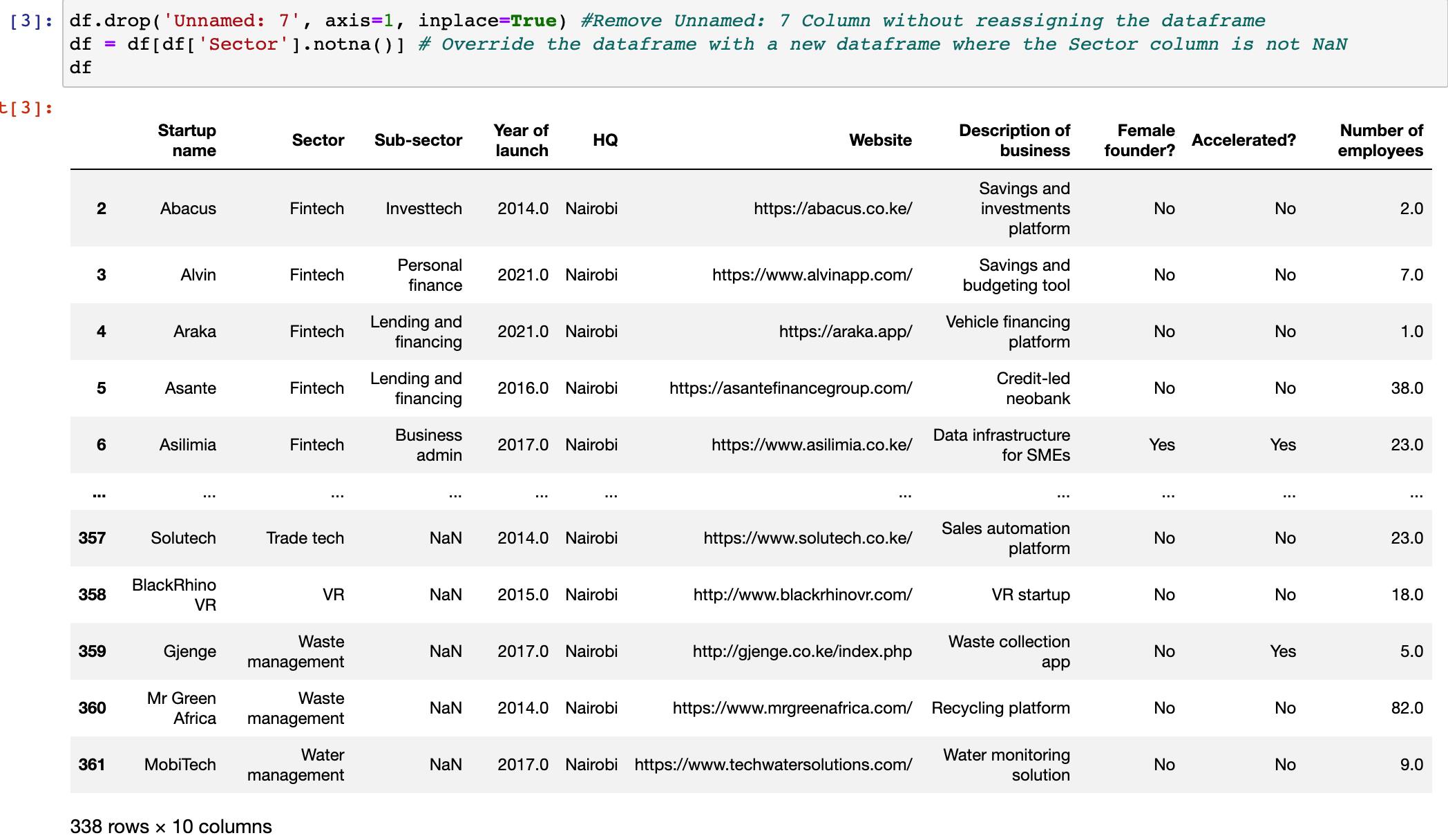
The next step was to clean up the dataframe into something that would be easier to plot. This is by removing any empty rows or columns, excel headers or other irrelevant information. After a glance, the only modifications I had to make were as follows:
Drop any empty row or column with no data or
NaNvaluesMaintain the first row as the index
Remove all Sector headers indicated
df.drop('Unnamed: 7', axis=1, inplace=True) #Remove Unnamed: 7 Column without reassigning the dataframe
df = df[df['Sector'].notna()] # Override the dataframe with a new dataframe where the Sector column is not NaN
df
Now I have a clean dataframe df that is ready for plotting.
Data Visualization
Here is where I started to visualize the report using matplotlib while checking for specific insights. Below, I will showcase the insight I got, the code used and the output.
Location
I plotted a simple bar graph where I grouped all locations by size and plotted them onto a bar chart. As seen below, most Startups have headquarters in Nairobi.
 # Group by locations
 locations = df.groupby(['HQ']).size().to_frame('Companies')
 # Initiate the Pie Chart
 fig_locations = px.pie(locations, values='Companies', names=locations.index, title='Locations')
 # Include labels to show the location and percentage
 fig_locations.update_traces(textposition='inside', textinfo='percent+label')
 # Visualize the data
 fig_locations.show()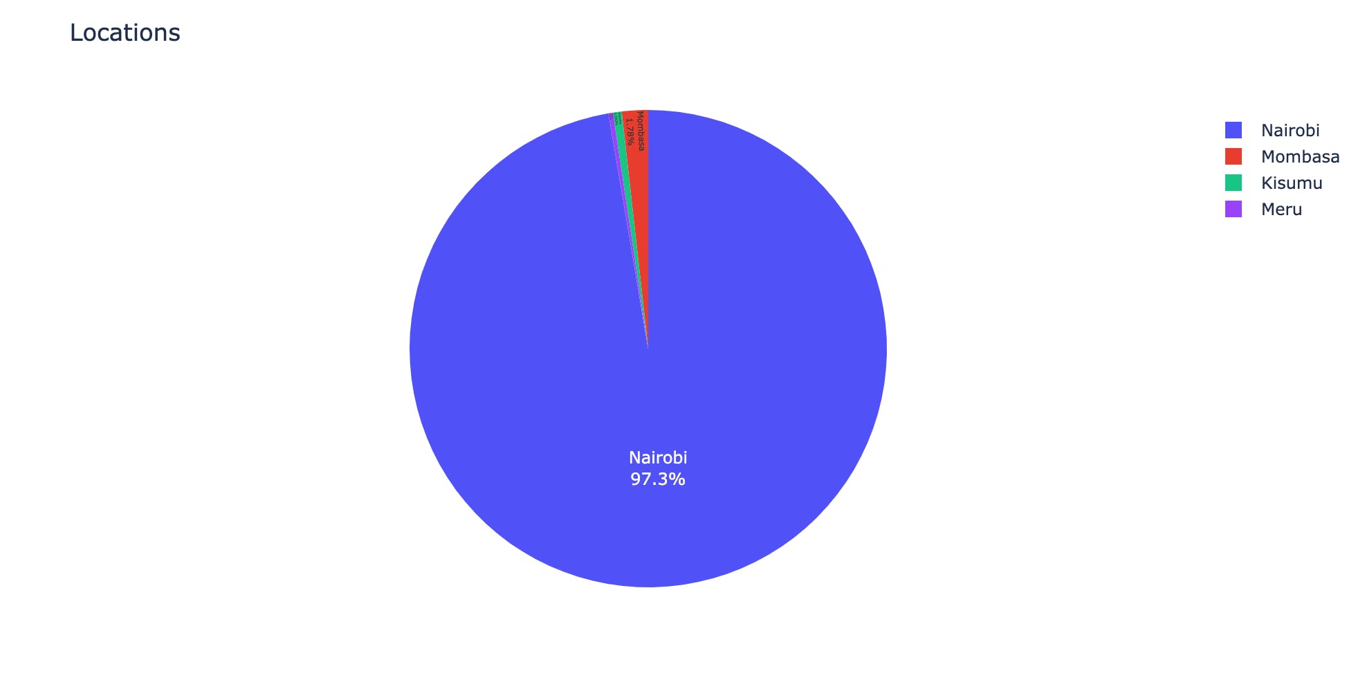
Year of Launch
To visualize the year created, I chose a scattered bubble chart, grouped the data by sector and plotted. As seen, there was a huge surge in Fintech startups in 2022 and 2021
 # Create a new dataframe grouping data by sector and year of launch
 year_created = df.groupby(['Year of launch', 'Sector']).size().to_frame('Number').reset_index()
 # Convert the Year column into an integer
 year_created['Year of launch'] = year_created['Year of launch'].astype('int')
 # Plot onto a scattered graph
 fig = px.scatter(year_created, x="Year of launch", y="Number",
              size="Number", color="Sector",
                  hover_name="Sector", log_x=True, size_max=40)
 fig.show()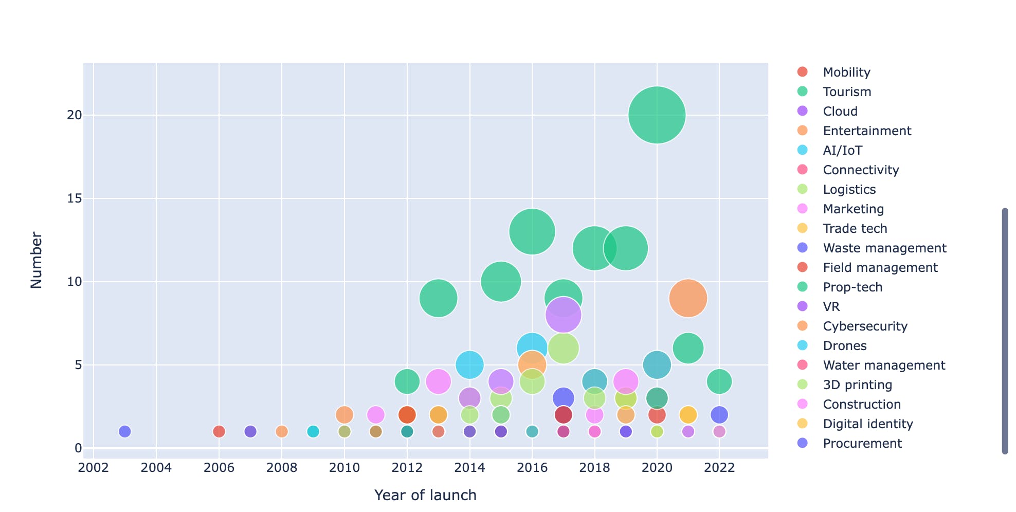
Female Founded Startups.
Here, I extracted only the female-founded companies and below are some interesting insights:
18% of all startups have Female Founders
  # Group the columns
  female_led = df.groupby(['Female founder?']).size().to_frame('Number')
  # Plot onto a graph
  fig_locations = px.pie(female_led, values='Number', names=female_led.index, title='Female Founded?')
  fig_locations.update_traces(textposition='inside', textinfo='percent+label')
  # Preview
  fig_locations.show()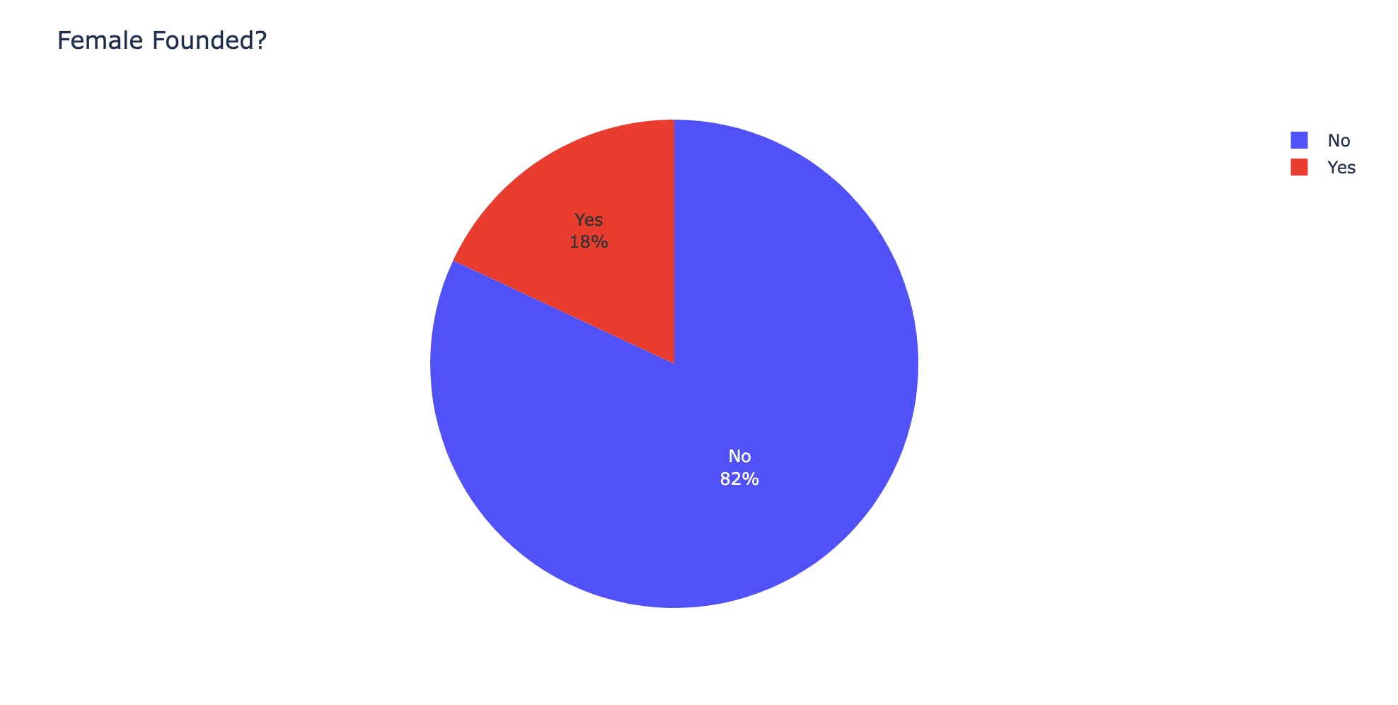
The oldest female-founded company is Komaza (komaza.com) which works in the Conversation Tech and hires the most employees (242)
oldest = df[df['Female founder?'] == 'Yes'].sort_values(['Year of launch'], ascending=[True])The highest percentage of female founders are in the Fintech industry, followed by E-Health, Recruitment and HR. The least being Construction and AI/IoT
  # Group sector where Female founder is Yes
  female_sectors = df[df['Female founder?'] == 'Yes'].groupby(['Sector']).size().to_frame('Number')
  # Create pie chart object
  fig_sectors = px.pie(female_sectors, values='Number', names=female_sectors.index, title='Female Founders by Sector')
  # Add labels onto the pie chart
  fig_sectors.update_traces(textposition='inside', textinfo='percent+label')
  # Preview
  fig_sectors.show()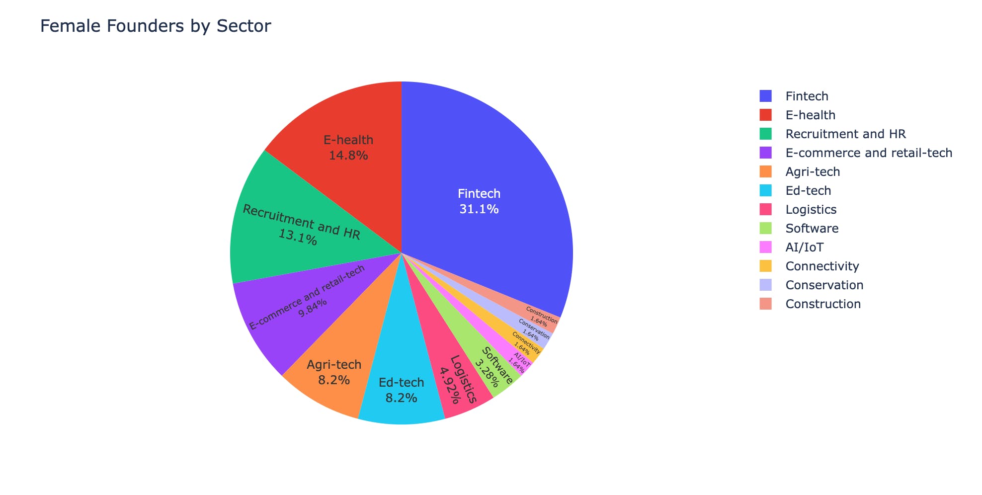
2016 had the highest spike in the number of female founders compared to any other year. It has been a stagnant trend for the following 6yrs.
  # Group by year of launch only when Female founder? is Yes
  female_founded = df[df['Female founder?'] == 'Yes']
  female_led = female_founded.groupby(['Year of launch']).size().to_frame('Number')
  # Plot onto a line graph
  fig = px.line(female_led, x=female_led.index, y="Number", title='Trend in Female Founded Companies')
  # Preview
  fig.show()

Gender Distribution
Tech startups are majorly male-dominated, but on a sector-to-sector basis, there are variations as some have more dominance than others.
 # Create new dataframes for each gender group
 female_founded = df[df['Female founder?'] == 'Yes']
 male_founded = df[df['Female founder?'] == 'No']
 # Group each dataframe by sector
 female_founded = female_founded.groupby(['Sector']).size().to_frame('Number').reset_index()
 male_founded = male_founded.groupby(['Sector']).size().to_frame('Number').reset_index()
 # Left merge to create a new dataframe on shared sectors
 merged = female_founded.merge(male_founded, how='left', on='Sector')
 # rename columns
 merged.rename(columns = {'Number_x':'Female Founders', 'Number_y':'Male Founders'}, inplace = True)
 merged.sort_values(['Female Founders', 'Male Founders'], ascending=[False, False])
 # Plot on graph
 fig = px.bar(merged, x="Sector", y=["Female Founders","Male Founders"], title="Gender Distribution by Sector")
 fig.show()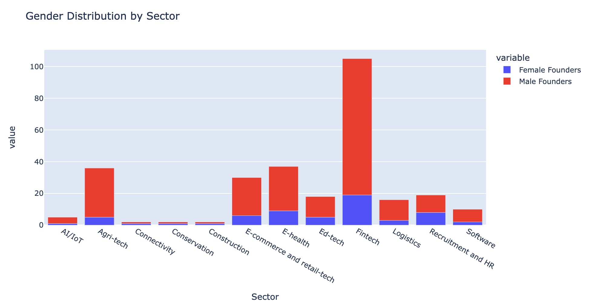
This graph however doesn't show sectors with no female founders. I merged and compared to get the results as indicated below.
 only_female = female_founded['Sector'][~female_founded['Sector'].isin(male_founded['Sector'])]
 # There were no sectors exclusively run by Female founders

 only_male = male_founded['Sector'][~male_founded['Sector'].isin(female_founded['Sector'])]
 # This gave me a list of sectors that dont have any female founders
 only_male
Accelerator
A surprising number of startups start from Accelerators and Incubators as seen from the graph and code below
 accelerated = df.groupby(['Accelerated?']).size().to_frame('Number')
 fig_locations = px.pie(accelerated, values='Number', names=accelerated.index, title='Accelerated?')
 fig_locations.update_traces(textposition='inside', textinfo='percent+label')
 fig_locations.show()
There is also an increase in the number of startups joining accelerators over the years, with the most common Startup Sector being Fintech and the most active year being 2020
 accelerator = df[df['Accelerated?'] == 'Yes'].groupby(['Year of launch', 'Accelerated?', 'Sector']).size().to_frame('Number').reset_index()
 accelerator['Year of launch'] = accelerator['Year of launch'].astype('int')
 fig = px.scatter(accelerator, x="Year of launch", y="Number",
              size="Number", color="Number",
                  hover_name="Sector", log_x=True, size_max=40)
 fig.show()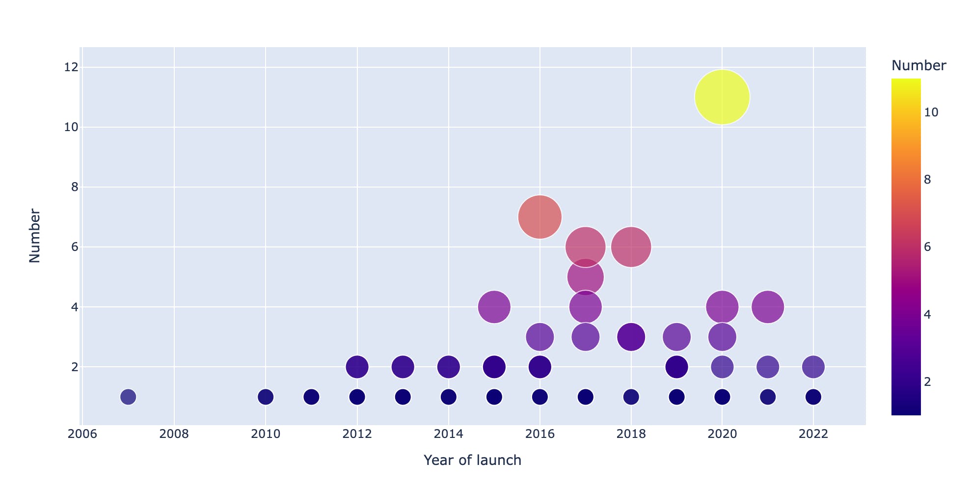
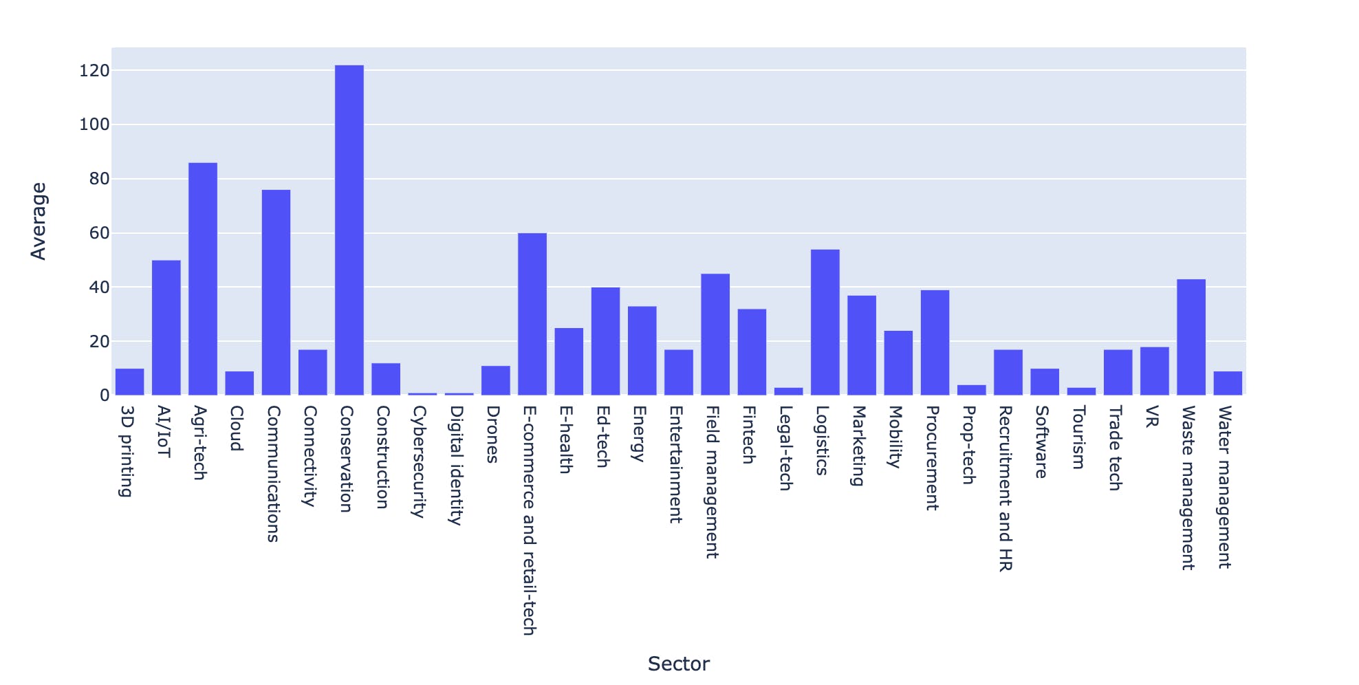
Employees
Kenyan Startups have hired a total of 13,140 employees with Conservation, Agritech and Ecommerce being the dominant sectors in recruitment
 total_employees = df['Number of employees'].sum()
 total_employees
average_employees = df.groupby(['Sector'])['Number of employees'].mean().to_frame('Average') average_employees['Average'] = average_employees['Average'].astype('int') # average_employees fig = px.bar(average_employees, x=average_employees.index, y='Average') fig.show()
Conclusion
Thanks for reading along, I hope to update the article or create a second part once I can curate more information like Funding, Salaries, Grants, News, Mergers or Acquisitions and more.
You can download the notebook and relevant files from here